



How to Increase OpenCart Sales Without Rebuilding the Entire Store
Low sales are not always caused by a lack of products or traffic.
In many stores, users already visit the website and view products, but they do not complete the purchase.
The reasons may be simple:
- inconvenient product pages;
- a weak first screen;
- overloaded checkout;
- unclear buttons;
- poor mobile adaptation;
- too many steps before purchase;
- slow page performance;
- lack of trust.
That is why OpenCart UX has a direct impact on conversion.
Even relatively small interface improvements can produce noticeable results.
1. Start With the First Screen
The first few seconds often determine whether a visitor stays on the website.
A hero section should immediately explain:
- what the store sells;
- why the offer is valuable;
- what the user should do next.
A weak hero:
Welcome to our store
A stronger hero:
OpenCart Modules
Automation, AI, CRM, and Integrations
Explore Solutions
The CTA should be obvious and easy to notice.
2. Use Modern Hero Banners and Slider Blocks
A static banner is no longer always enough.
A modern hero section can include:
- headline;
- subtitle;
- CTA;
- categories;
- trust elements;
- rating;
- promo strip;
- animations;
- background effects;
- product blocks.
For example, Smart Slider AI can be used to build more flexible hero sections and promotional compositions without constantly editing theme code.
The main rule is simple: do not overload the first screen.
One strong CTA is usually better than five weak ones.
3. Optimize the Product Page
The product page is one of the most important sales pages in the store.
It should quickly answer the customer’s key questions:
- What is this?
- How much does it cost?
- Why should I buy it?
- Is it available?
- How do I receive it?
- Can I trust the store?
The upper part of the product page should usually contain:
- product name;
- price;
- special price;
- availability;
- CTA;
- images;
- short benefits;
- rating or trust block.
The customer should never have to search for the purchase button.
4. Make the “Buy” Button Impossible to Miss
The CTA button should be visually obvious.
Common mistakes include:
- button is too small;
- poor contrast;
- different styles across pages;
- hover state does not work;
- button is below the first screen on mobile;
- text looks like a normal link.
A strong CTA button should have:
- clear color;
- contrasting text;
- sufficient height;
- understandable hover behavior;
- consistent styling throughout the store.
5. Improve the Product Gallery
Images often sell better than text.
A product gallery should be:
- fast;
- responsive;
- clean;
- free of unnecessary borders;
- built around a large main image;
- supported by clear thumbnails;
- compatible with fullscreen preview.
For products where details matter, zoom can also be useful.
6. Do Not Overload the Page With Information
A longer description does not automatically mean better conversion.
Content should be structured.
For example:
- Description
- Specifications
- Documentation
- Gallery
- Changelog
- Reviews
This is especially important for digital products and OpenCart modules.
All information should be available, but it should not distract from the main action: purchasing.
7. Add Trust Elements
Customers need to understand that the store is reliable.
Useful trust elements include:
- rating;
- review count;
- warranty;
- secure payment;
- official support;
- fast delivery;
- regular updates;
- compatibility information.
For example:
4.9 / 5
500+ Customers
Post-Purchase Support
Regular Updates
These elements can reduce hesitation before purchase.
8. Show Compatibility Clearly
For OpenCart extensions, this is critical.
Users should immediately see:
- OpenCart 2.3;
- OpenCart 3.x;
- ocStore;
- OCMOD;
- PHP version;
- theme compatibility.
If compatibility is unclear, the user may simply leave the page.
9. Improve Checkout
A complicated checkout is one of the most common reasons for lost sales.
The standard checkout may contain too many fields.
For a digital store, you may not need:
- address;
- city;
- postcode;
- shipping;
- unnecessary steps.
It is often better to keep only what is actually required.
For example:
- name;
- phone;
- email;
- payment method.
The shorter the path to purchase, the higher the chance that the customer finishes the order.
10. One Page Checkout or Step-by-Step Checkout
Both approaches can work well.
One Page Checkout
Advantages:
- everything is visible at once;
- fewer transitions;
- good for simple orders;
- convenient for digital products.
Step-by-Step Checkout
Advantages:
- less information on each screen;
- suitable for complex orders;
- useful for shipping and multiple fields.
The main thing is to avoid duplicate steps and make sure the final purchase button is always available.
11. Use a Sticky Order Summary
On desktop, it can be useful to keep the Order Summary block fixed while the customer scrolls.
It should show:
- product;
- quantity;
- price;
- discount;
- total;
- checkout button.
This reduces unnecessary scrolling and keeps the purchase context visible.
12. Mobile UX Is More Important Than Desktop
For many stores, most traffic comes from smartphones.
That means mobile UX should be designed intentionally.
Check:
- font size;
- button size;
- spacing;
- dropdowns;
- sticky panels;
- search;
- cart;
- checkout;
- gallery;
- hero section.
Something that looks great on desktop can still be frustrating on mobile.
13. Add a Sticky CTA on Mobile
A fixed bottom panel can be very effective.
For example:
Price | Buy Now
or:
Cart | Buy Now
This prevents users from having to scroll back to the top after reading a long description.
14. Improve the Mini Cart
A mini cart should be more than a basic dropdown.
A modern mini cart can display:
- product image;
- product name;
- quantity;
- price;
- subtotal;
- “View Cart” button;
- “Checkout” button.
It should also work via AJAX.
After adding a product, the user should not lose their position on the page.
15. Use Cross-Selling
After a product is added to the cart, you can show:
- similar products;
- complementary modules;
- recommended extensions;
- accessories;
- bundles.
For example:
Customers who buy CRM PRO often also choose Smart Slider AI.
Cross-selling can increase average order value.
16. Use Social Proof
Social proof is particularly effective for digital products.
You can display:
- number of customers;
- rating;
- reviews;
- download count;
- popularity;
- recent updates.
The data should always be real.
17. Add an FAQ
FAQ sections help remove objections before purchase.
For example:
Does the module work with OpenCart 3?
Yes.
Does it require ionCube?
No.
Is support included?
Yes.
Can I install it myself?
Yes, installation instructions are included.
This can reduce pre-sale questions and improve conversion.
18. Show the Changelog
For OpenCart modules, the changelog is a strong trust signal.
It shows that the product is actively maintained.
For example:
v2.13.38
- new Hero controls;
- background FX;
- social proof;
- category visibility controls.
Regular updates increase buyer confidence.
19. Improve Search
If users cannot find a product, they cannot buy it.
Search should:
- work quickly;
- support autocomplete;
- show images;
- show prices;
- support SKU search;
- avoid heavy database queries.
This is especially important for large catalogs.
20. Optimize Speed
UX is not only about design.
Page speed directly affects conversion.
You should monitor:
- heavy SQL queries;
- oversized images;
- unnecessary JavaScript;
- render-blocking resources;
- caching;
- AJAX behavior;
- CRON processes.
If a page takes 8–10 seconds to load, even the best design will struggle to convert.
21. Optimize Images
Product images should be:
- high enough quality;
- not unnecessarily large;
- correctly sized;
- responsive;
- served in modern formats where supported.
Images are often the largest contributor to page weight.
22. Use Animation Carefully
A modern store can use:
- hover effects;
- fade transitions;
- micro-interactions;
- smooth animations;
- animated backgrounds;
- slider effects.
But animation should never get in the way.
The principle is simple:
Animation should help users understand the interface, not distract them from it.
23. Build a Consistent Design System
A large OpenCart store often contains many modules.
If every module uses different:
- colors;
- buttons;
- border radius;
- shadows;
- fonts;
the store starts to look inconsistent.
It is better to maintain one design system with:
- primary color;
- accent color;
- typography;
- spacing;
- radius;
- button styles;
- cards;
- hover states.
24. Use Light and Dark Themes Correctly
Dark Mode can be a useful feature.
It works especially well for:
- tech stores;
- digital products;
- software modules;
- SaaS-like interfaces.
But dark mode should not be added just for visual effect.
Contrast and readability are more important.
25. Add Personalization
Even simple personalization can improve UX.
For example:
- recently viewed products;
- recommended products;
- popular categories;
- personalized banners;
- order history.
In a Digital Customer Hub, you can also show products the user has already purchased.
26. UX Does Not End After Purchase
After payment, the user should not reach a dead end.
A good success page can include:
- order number;
- order status;
- CTA to “My Modules”;
- downloads;
- documentation;
- support;
- recommended products.
For digital stores, this is especially important.
27. Use a Digital Customer Hub
The customer account should be more than an order history page.
It can become a full Digital Hub with:
- purchased modules;
- downloads;
- versions;
- changelog;
- documentation;
- licenses;
- support.
This improves the post-purchase experience and can encourage repeat sales.
28. Analyze Behavior, Not Just Traffic
Knowing how many visitors you have is not enough.
You also need to understand:
- where users leave;
- where they fail to click the CTA;
- which products they view;
- where checkout is abandoned;
- which pages are slow.
UX optimization should be based on behavior and data.
29. A/B Test Important Elements
It is not always obvious which design performs better.
You can test:
- button text;
- CTA color;
- hero section;
- block order;
- checkout layout;
- social proof;
- popups.
Even a small conversion improvement can have a large financial impact when traffic is high.
30. Do Not Copy Design Trends Without a Reason
Modern design is not just glassmorphism, gradients, and rounded cards.
Every element should have a purpose.
Before adding something, ask:
Does this help the user complete a purchase?
If the answer is no, the element may not be necessary.
OpenCart UX as a Complete System
The best results do not come from one “magic” button.
They come from the whole flow:
Hero → Category → Product → CTA → Cart → Checkout → Success → Customer Hub
If each stage is clear, fast, and logical, conversion improves.
Modern OpenCart Solutions by SHOPX
At SHOPX, we develop tools that help modernize OpenCart stores and automate sales workflows.
Smart Slider AI
Modern hero sections, sliders, promotional compositions, and product blocks.
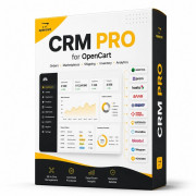
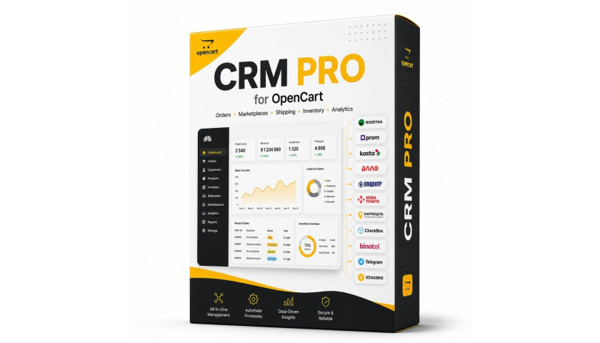
CRM PRO
Order, customer, marketplace, and business process management.
Image Forge AI
Product image enhancement and automation.
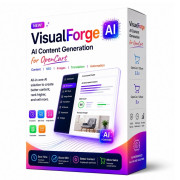
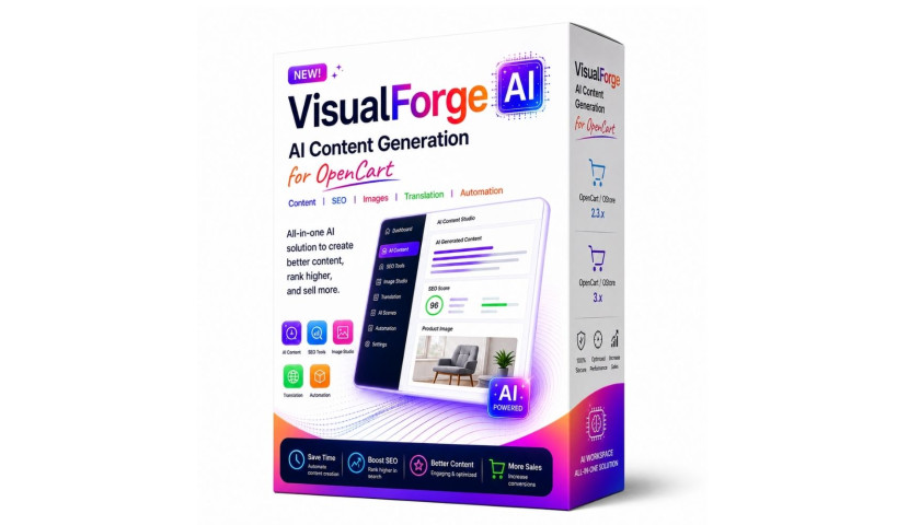
VisualForge AI
AI content, SEO, translation, and catalog automation.
Combined with a modern OpenCart theme, these tools help create more than just a visually attractive store — they help build a complete sales system.
Conclusion
To increase sales in OpenCart, you do not always need to increase your advertising budget.
First, make sure your store is not losing the traffic it already has.
The most important areas to improve are:
- first screen;
- product page;
- CTA;
- mobile experience;
- mini cart;
- checkout;
- speed;
- trust;
- post-purchase UX.
A modern OpenCart UX should shorten the distance between:
“I’m interested in this product”
and
“I bought it.”
That is what turns design from decoration into a real sales tool.
Match a module to a specific UX problem
Choose OpenCart conversion modules after examining the customer journey. If the first screen does not communicate an offer, explore Smart Slider AI for responsive OpenCart sliders; if product explanations are incomplete, review Visual Forge AI content tools. Compare customer behavior before and after the change. Installing an extension alone does not guarantee more sales.
No comments yet. Be the first!
Leave a Comment